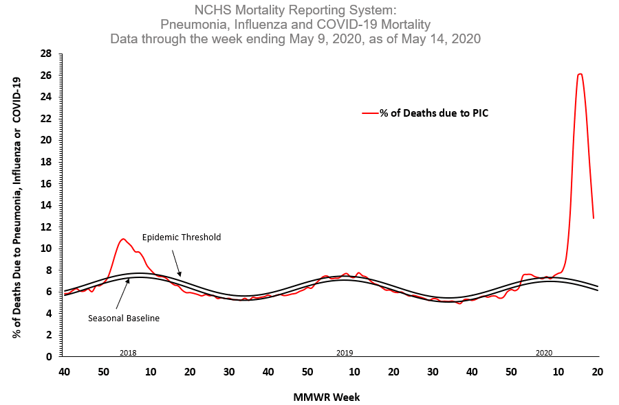
A couple of things to notice in the chart below:
1) To "juice" the death numbers they publish, the folks at the National Center for Health Statistics (NCHS) are now lumping Covid-19 deaths with 'ordinary' flu and pneumonia deaths. "PIC," in the chart below, means "pneumonia, influenza, Covid"
2) What you see plotted is the % of ALL deaths that are assigned to Covid, flu and pneumonia.
3) This is a 3 year "look back" and the rising and falling lines you see is a visualization of 3 years of flu seasons.
4) As you can see, we had a big surge and now we're on a track that looks like this is pretty much over in the next few weeks.
....but will the media and Democrats allow it to go away when it has been so useful to them this far?

"KILLER" CUOMO
This morning, I heard that as many as 5,300 elderly people died as a direct result of
NY State's policy of forcing superannuated Covid patients back to their nursing homes to infect others. That number is close to twice the number of deaths which occurred in 9/11.
Has Andrew Cuomo and his Health Commissioner suffered a widely publicized
rebuke by the Dem-friendly"media?" - if any, it's not much and this mass murderer
is still held up as the paragon of how a governor handled the Covid crisis.
During the pandemic, Cuomo was wrong time and again and many people died as a result, but he is protected from criticism by his "dull blue" party affiliation.

No comments:
Post a Comment